
Every revenue dashboard you have ever used answers a fixed menu of questions. Pipeline by stage. Deals by owner. Win rate this quarter versus last. It's genuinely useful, right up until the question that actually matters isn't on the menu. Then you're exporting three CSVs or pay premium to dump "as-is" into a DB with no structure at all, and then rebuilding the truth by hand with VLOOKUPs in a spreadsheet nobody else can reproduce.
That is not a data problem, the data is fine. It's a reporting-architecture problem, and it's the main reason I started this space. Another one is thousands of people still build their PowerBI dashboards by hand, using paid nonstructured database replications. No problem with that in 2020 yet it's 2026 now.
Here's the promise, in one line: most days I'll take one real revenue question that a standard CRM report can't answer, show you why it can't, and show you the exact query that can. The numbers, the reasoning, and the SQL, so you can check my work instead of taking my word for it.
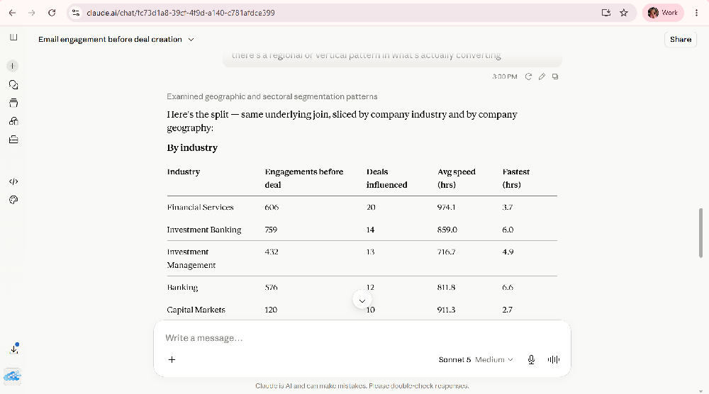
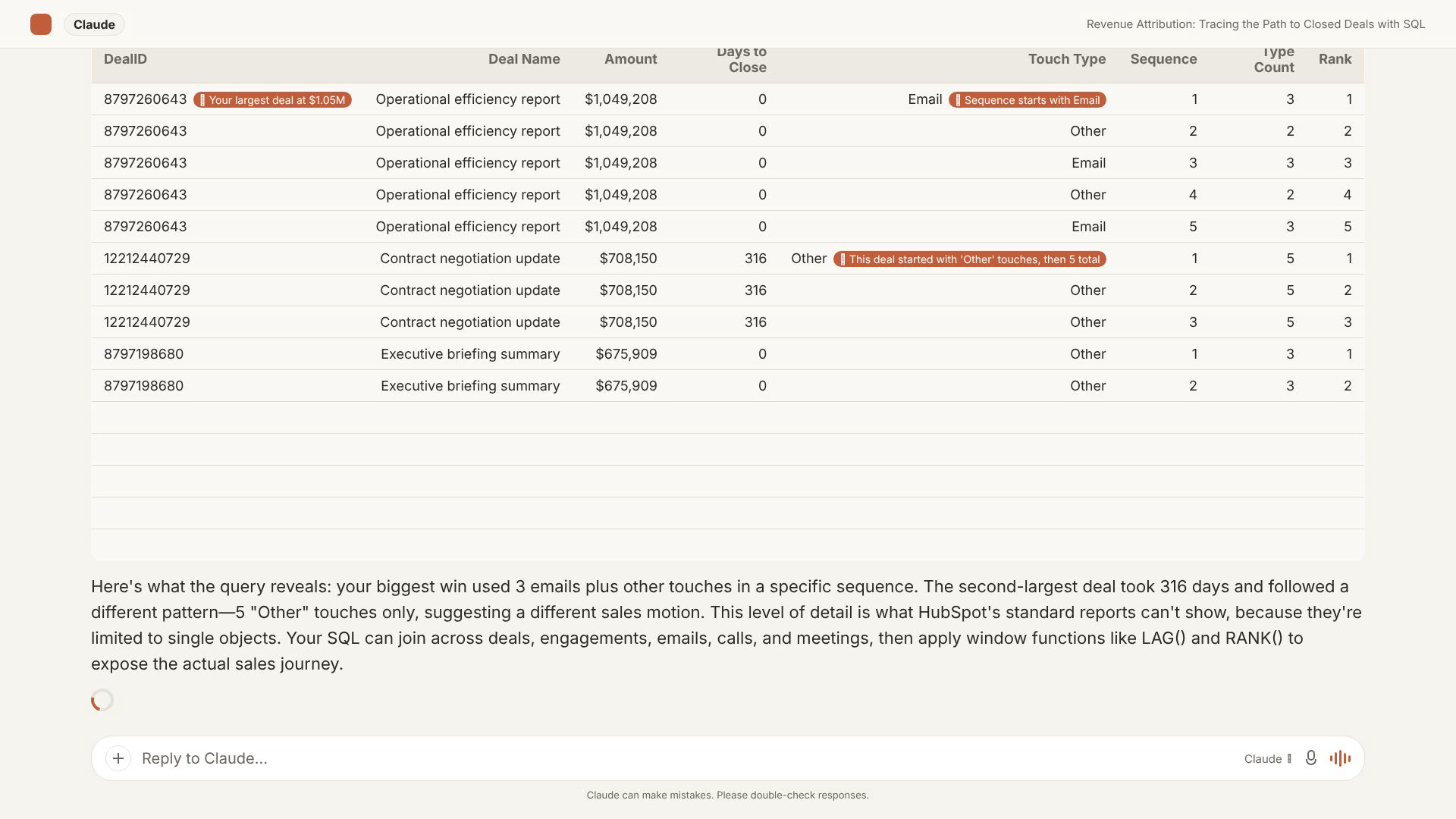
Plain-English question in, ranked answer out - with the exact SQL it ran, so you can check it.
Let me show you what I mean with three questions. None of them is exotic. Every one of them breaks the standard report builder.
1. "Are the forecast odds in my CRM actually true?"
Your CRM ships every deal stage with a configured win probability: Proposal is 70%, and so on. Those numbers roll straight into your weighted forecast. So the fair question is: for your company's history, are they right?
Run it against real stage history and the answer is usually "no, and not by a little." A common pattern: an "On Hold" stage configured at 10% has a true historical win rate of 0% across every deal that ever entered it. Means dead pipeline, quietly inflating the board number at ten cents on the dollar. Meanwhile "Proposal," configured at 70%, actually closes around 63%. Every deal in it is worth $70 on the forecast and $63 in the bank. Multiply that across a full pipeline and you've found the chronic gap between "forecast" and "what landed."
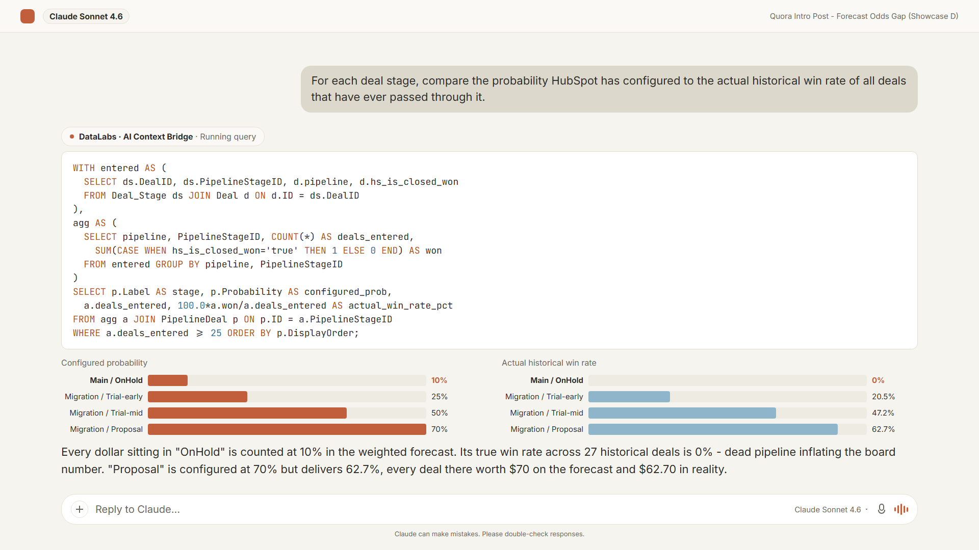
What the CRM thinks a stage is worth, next to what it's actually worth
The whole correction is four numbers from one query:
WITH entered AS (
    SELECT
        ds.DealID
        , ds.PipelineStageID
        , d.pipeline
        , d.hs_is_closed_won
    FROM Deal_Stage ds
    JOIN Deal d ON d.ID = ds.DealID
),
agg AS (
    SELECT
        pipeline
        , PipelineStageID
        , COUNT(*) AS deals_entered
        , SUM(CASE WHEN hs_is_closed_won = 'true' THEN 1 ELSE 0 END) AS won
    FROM entered
    GROUP BY pipeline, PipelineStageID
)
SELECT
    p.PipelineLabel
    , p.Label AS stage
    , ROUND(CAST(p.Probability AS FLOAT), 2) AS configured_prob
    , a.deals_entered
    , ROUND(100e0 * a.won / NULLIF(a.deals_entered, 0), 1) AS actual_win_rate_pct
FROM agg a
JOIN PipelineDeal p
    ON p.ID = a.PipelineStageID AND p.Pipeline = a.pipeline
WHERE p.IsClosed = 0 AND a.deals_entered >= 25
ORDER BY p.PipelineLabel, p.DisplayOrder;
Why the dashboard can't: it needs the stage-transition history (not a first-class object in the report builder), a step that aggregates entries before joining to stage definitions, and a HAVING filter to throw out thin samples. Filtering that happens after aggregation. Native report builders filter before they aggregate. All three sit outside what single-object reporting is built to do.
2. "Is my healthy retention hiding a segment that's already leaving?"
Blended Net Revenue Retention is a single average across your whole book. It can read as a healthy 106% purely because expansion from your biggest accounts is mathematically papering over churn somewhere else. The blended number has no way to show you both motions at once.
Split it by acquisition segment and signup cohort and the two stories separate: the Enterprise book from 18 months ago expanding well past 100%, while the SMB cohort from that same period has already retained just 68% of its logos. The blended 106% wasn't wrong. It was hiding which motion works and which one is leaking. And the two were invisible to each other until you cohorted them.
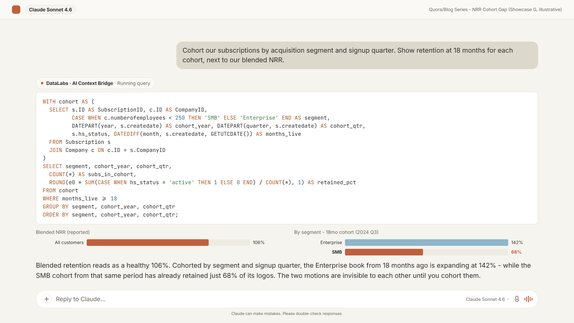
Same blended NRR, two very different stories underneath it
Why the dashboard can't: cohorting means grouping customers by when they started and tracking status at fixed intervals afterward - a self-referencing, time-bucketed aggregation that no single-object report expresses. Where cohort/retention views exist in CRM or BI tools at all, they're routinely gated to the top pricing tier. A blended number is the thing every tool ships precisely because cohorting it is the harder feature.
3. "Do two of my reps even mean the same thing by 'Proposal'?"
This is my favorite, because it's the one no reporting tool can fix and it isn't about math.
Every deal stage carries one configured probability, and that number bakes in an assumption: that every rep enters the stage on the same evidence. They don't. Suppose one rep drags a deal into "Proposal" the moment any client email lands in their inbox, while another only moves it there after a live call where the buyer signals real intent. Same label, two completely different events, and the forecast weights both at the configured 70%.
Weight each rep's Proposal pipeline by that rep's own historical close rate out of Proposal, and the ranking can flip outright: a book that looks like $868K at the configured rate is worth $310K at how that rep actually uses the stage, while a smaller, higher-conviction book overtakes it.
Why nothing can until now: the correction ("this rep enters Proposal early") isn't in your data model. It lives in the sales manager's head. There has never been anywhere in a reporting stack to record it, so every tool applies the one configured number to everyone and silently averages incomparable things together. This is the part that changed. You can now state that fact once, in plain English - "account for this whenever you report on stages" - and the system stores it and re-applies it automatically on every future question, showing the adjusted SQL so it stays auditable rather than becoming a black box.
The pattern under all three
These aren't three quirks. They're the same wall three times:
- The value lives in the joins. The useful questions span objects: deals and stage history and owners and engagements, and single-object report builders top out at joining one or two.
- They need an aggregate of an aggregate. "The average of each rep's win rate" is a calculation on top of a calculation. Report UIs can show you totals; they can't take the average of those totals across a filtered subset. That's the step that sends everyone to Excel.
- They need window functions. "20% longer than the historical average for that owner" means computing a baseline and comparing every row to it. There's no native equivalent.
- And some of it lives in people's heads, not the schema - a field whose meaning drifted last quarter, a rep's stage habits - with nowhere in any tool to write it down.
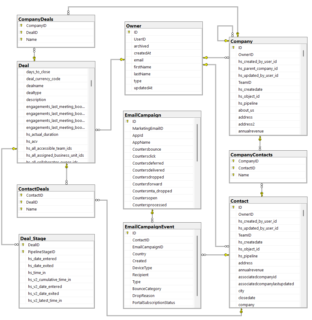
One object at a time, versus every object joined the way a database engineer would.
What actually changes
The fix isn't a smarter chatbot bolted onto your CRM's API. I do know people use HubSpot MCP nowadays to compose their complex analytics dashboard. Painfully slow chewing through every CRM object API has to offer, putting strain on HubSpot infrastructure every time they need a report. Sincerely hope to change that habit with this series of posts. An AI hitting the API one object at a time can tell you a single deal's current stage, for 100 when in batches - but the reliability collapses the moment you ask anything that needs a join, a derived metric, or an aggregate across a filtered set, which is most real analytics. And try asking for campaign email per-contact events aggregated via the same builtin MCP. I'll write more on that down the road.
The approach I've come to trust is boring in the best way: turn the CRM into a real database, then let the AI query it. In our case (AI Context Bridge for HubSpot) that means a read-only OAuth sync of your HubSpot into your own SQL Server database - proper tables, real foreign keys - sitting behind an endpoint that Claude or ChatGPT can query. You ask in plain English; the model writes the T-SQL, runs it against your live data, answers in plain English, and shows you the query. Every answer comes from your data, not the model's imagination, and any analyst can re-run it. The context you teach it - a drifted field, a rep's habits - persists and resurfaces on later questions on its own.
That's the engine. The AI is just the interface.
Note on AI content
If this post smells AI to you — it's because most of it is indeed AI. Makes sense though — after all datalabs.store is an engineering-first company, not a marketing-first one. I'd happily be posting human written texts here, have a lot to say and know my way around the keyboard. It's just there are tons of more important things to do towards the product itself.
When you think of it for a minute it goes even further — marketing of a company can convince you to become a customer. Engineering of a software company can convince you to stay. I'd rather you stay than come easily go easier. There are almost no products out there where people could say "your marketing is awesome so I stay being a customer even though product is absolutely terrible". I know one such company, customer of theirs myself, yet they're unique. And it's not quite the product is terrible — best in the class — just class itself is a big ugly.
Speaking of good marketing — have seen a product led by a brilliant business person, it's just the product was terribly engineered, luckily went much better over time. Got 10 subscriptions a month, lost 10 subscriptions a month — saddening situation, not something I'd want for datalabs.store.
What this space will be
One post at a time, this is the beat:
- A real revenue question the standard dashboard can't answer. Forecast integrity, cohort retention, attribution, pipeline hygiene, margin drift etc.
- Why it structurally can't be built in single-object reporting.
- The query that answers it, in the open.
If you run RevOps, sales ops, or finance on top of a CRM and you're tired of the answer being "export it and we'll figure it out in a spreadsheet," follow along - and send me the question your dashboard won't answer. Good chance it becomes a post.
You can also just watch it work: there's a live demo you can poke at with no signup, and a free-forever plan, at datalabs.store.
A typical follow-up: 'now filter that to deals over $50K' just extends the same query.