
Your HubSpot dashboards answer the questions you knew to ask.
DataLabs.store is for every other one.
The questions that matter span your whole CRM: reps and their habits, deals and stages, customers and their engagements, all at once. That's exactly what builtin dashboards and reports can't answer. Ask Claude or ChatGPT in plain English to build a custom one, tailored to your business, and get the whole picture back in seconds.
It's not a raw copy of your data — it's structured and enriched with the context an AI needs: field meanings, known values, notes you've taught it, and past queries. A single search surfaces anything relevant across all of it, so every answer draws on what your team already knows, not just what's in the tables.
Paid plans start at $64/month, billed monthly or annually, free trial included. Free plan is free forever.
Blended retention looks healthy — split by acquisition segment and signup cohort, and a churning segment can hide behind an expanding one. Cohorted retention like this is a view most CRMs reserve for their top tier, if they offer it at all.
A custom cost field can quietly change what it measures. Every automated margin report shows a sudden crash — correct for exactly when the field's meaning changed, and the crisis disappears. The fix lives in a note the AI remembers, not a schema migration.
One rep marks a deal "Proposal" the moment an email lands; another only after a call confirms real intent. Weight each rep's pipeline by how they personally use the stage, and the real forecast — and the ranking — flips.
Real questions, real prompts: how people use the product
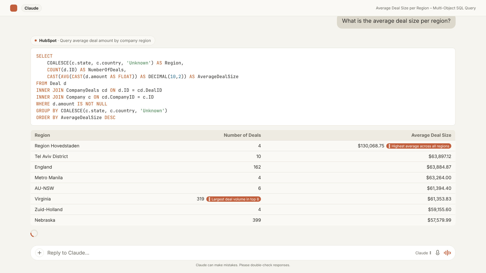
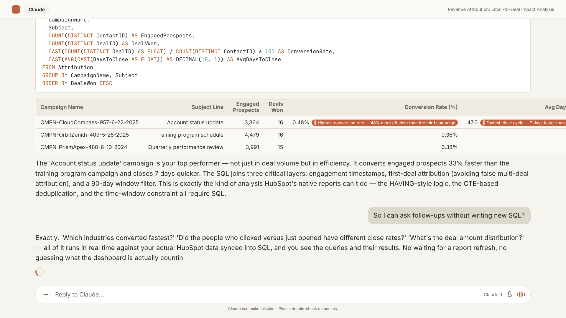
Every prompt below is a real query pattern, already generated for a specific question - illustrations of the pattern, not canned reports. The AI Context Bridge writes queries like these fresh, for your own portal's schema and the business context it learns directly from your HubSpot data.
Our blended NRR looked healthy. It was hiding a segment that was quietly churning.
We already had a retention dashboard - it just showed one blended number every month, and a blended number can't show two opposite trends at once. Nobody thought to split it by acquisition segment and signup date until the SMB churn had been building for months, quietly offset by enterprise expansion on the same line.
See the SQL and the full result
The blended number wasn't wrong - it was just hiding which motion was actually working (Enterprise expansion) and which one was quietly leaking (SMB churn) until we cohorted it. Cohorted retention like this is a view most CRMs reserve for their top tier, if they offer it at all.
WITH cohort AS (
  SELECT s.ID, c.ID AS CompanyID,
    CASE WHEN c.numberofemployees < 250 THEN 'SMB' ELSE 'Enterprise' END AS segment,
    DATEPART(year, s.createdate) AS cohort_yr, DATEPART(quarter, s.createdate) AS cohort_q,
    s.hs_status, DATEDIFF(month, s.createdate, GETUTCDATE()) AS months_live
  FROM Subscription s JOIN Company c ON c.ID = s.CompanyID
)
SELECT segment, cohort_yr, cohort_q, COUNT(*) AS subs,
  ROUND(100e0 * SUM(CASE WHEN hs_status='active' THEN 1 ELSE 0 END) / COUNT(*), 1) AS retained_pct
FROM cohort WHERE months_live >= 18
GROUP BY segment, cohort_yr, cohort_q
ORDER BY segment, cohort_yr, cohort_q;| Segment | Cohort | Retained @ 18mo |
|---|---|---|
| Enterprise | 2024 Q3 | 142% (expansion) |
| SMB | 2024 Q3 | 68% |
| Blended (reported NRR) | — | 106% |
Our margin looked like it fell off a cliff last quarter. It hadn't — a field had just quietly changed what it measured.
Finance already had a margin tracker built off the same field, and it flagged what looked like a real crisis. Nobody had caught that a shared cost field started folding in a new expense category that same quarter - a dashboard just shows the number, it has no way to know when a column's meaning changed underneath it.
See the SQL and the full result
The as-recorded trend showed margin falling from 60.8% to 52.1% at Q2 and staying down - a five-alarm fire in any board deck. Corrected for the fact that "raw_cost" quietly started folding in logistics spend that quarter, the trend was flat at roughly 60%. The drop was an accounting artifact, not a business event - and the correction is a plain-English note the AI remembers, applied once and reused on every future margin question, not a schema migration or an analyst ticket.
SELECT DATEPART(year, d.closedate) AS yr, DATEPART(quarter, d.closedate) AS qtr,
  ROUND(100e0 * SUM(d.amount - d.raw_cost) / SUM(d.amount), 1) AS margin_as_recorded,
  ROUND(100e0 * SUM(d.amount - (d.raw_cost -
    CASE WHEN d.closedate >= '2026-04-01' THEN 0.09 * d.amount ELSE 0 END)) / SUM(d.amount), 1) AS margin_corrected
FROM Deal d
WHERE d.hs_is_closed_won = 'true'
GROUP BY DATEPART(year, d.closedate), DATEPART(quarter, d.closedate)
ORDER BY yr, qtr;| Quarter | As recorded | Corrected |
|---|---|---|
| 2026 Q1 | 60.8% | 60.8% |
| 2026 Q2 | 52.1% | 60.5% |
| 2026 Q3 | 51.4% | 60.1% |
Two of our reps meant two different things by "Proposal." Our forecast couldn't tell them apart.
Our sales dashboard weighted every "Proposal" deal the same, because that's the only number HubSpot has for the stage. It took a sales manager noticing one rep's Proposal deals kept falling through late to realize the label meant two very different levels of commitment depending on who entered it.
See the SQL and the full result
At the configured 70%, one rep's Proposal book looked more than twice another's. Adjusted for how each rep actually used the stage - one moved a deal there the moment an email landed, another only after a call confirmed real intent - the ranking flipped. The correction wasn't a data-model change; it's a note the AI applies to every future question about that pipeline.
WITH rep_hist AS (
  SELECT d.OwnerID,
    SUM(CASE WHEN d.hs_is_closed_won='true' THEN 1 ELSE 0 END) AS won,
    SUM(CASE WHEN d.hs_is_closed='true' THEN 1 ELSE 0 END) AS closed
  FROM Deal_Stage ds JOIN Deal d ON d.ID = ds.DealID
  JOIN PipelineDeal p ON p.ID = ds.PipelineStageID
  WHERE p.Label = 'Proposal'
  GROUP BY d.OwnerID
)
SELECT o.firstName + ' ' + o.lastName AS rep,
  SUM(d.amount) AS open_value,
  ROUND(100e0 * rh.won / rh.closed, 1) AS rep_win_rate,
  SUM(d.amount) * rh.won / rh.closed AS weighted_at_rep_rate
FROM Deal d
JOIN PipelineDeal p ON p.ID = d.dealstage AND p.Label = 'Proposal' AND p.IsClosed = 0
JOIN rep_hist rh ON rh.OwnerID = d.OwnerID
LEFT JOIN Owner o ON o.ID = d.OwnerID
GROUP BY o.firstName, o.lastName, rh.won, rh.closed
ORDER BY weighted_at_rep_rate DESC;| Rep | Open value | Own win rate | Weighted @ 70% | Weighted @ real rate |
|---|---|---|---|---|
| Peter Castillo | $1,240,000 | 25% | $868,000 | $310,000 |
| Nala Adams | $520,000 | 85% | $364,000 | $442,000 |
HubSpot told us Proposal deals close 70% of the time. Our own history said otherwise.
We had a forecast dashboard built right off HubSpot's configured stage odds, and it looked authoritative because it was always up to date. It just never occurred to anyone to check those percentages against what our own deals actually did once they reached each stage.
See the SQL and the full result
Every dollar sitting in "OnHold" was counted at 10% in the weighted forecast. Its true win rate across 27 historical deals was 0% - dead pipeline inflating the board number. "Proposal" was configured at 70% but delivered 62.7% in reality. Multiplied across a full pipeline, that gap explains the chronic difference between "forecast" and bank balance - and it's four numbers from one query against your own history.
WITH agg AS (
  SELECT d.pipeline, ds.PipelineStageID, COUNT(*) AS deals_entered,
    SUM(CASE WHEN d.hs_is_closed_won='true' THEN 1 ELSE 0 END) AS won
  FROM Deal_Stage ds JOIN Deal d ON d.ID = ds.DealID
  GROUP BY d.pipeline, ds.PipelineStageID
)
SELECT p.PipelineLabel, p.Label AS stage, p.Probability AS configured_prob,
  a.deals_entered, ROUND(100e0 * a.won / a.deals_entered, 1) AS actual_win_rate
FROM agg a JOIN PipelineDeal p ON p.ID = a.PipelineStageID AND p.Pipeline = a.pipeline
WHERE p.IsClosed = 0 AND a.deals_entered >= 25
ORDER BY p.PipelineLabel, p.DisplayOrder;| Stage | Configured | Deals | Actual win rate |
|---|---|---|---|
| OnHold | 10% | 27 | 0% |
| Trial (early) | 25% | 234 | 20.5% |
| Proposal | 70% | 118 | 62.7% |
Our biggest email blasts got the most opens. We assumed that meant they were working hardest.
Marketing's own dashboard ranked campaigns by reach and open rate, and the mass sends always won that ranking. Nobody had connected an individual email all the way through to whether the person who opened it actually became a customer, because that link lives in a different object than the one the email report reads from.
See the SQL and the full result
Reach and conversion ranked in opposite order. The low-volume, targeted sends converted 5–20× better than the mass-blast emails that reached thousands. Marketing headcount naturally gravitates to the campaigns with the biggest reach numbers - this view says the smaller, targeted sends were quietly doing the conversion work.
WITH eng AS (
  SELECT EmailCampaignID, ContactID, MIN(Created) AS first_touch
  FROM EmailCampaignEvent WHERE Type IN ('OPEN','CLICK') AND ContactID IS NOT NULL
  GROUP BY EmailCampaignID, ContactID
),
first_deal AS (
  SELECT cd.ContactID, MIN(d.createdate) AS first_deal_date
  FROM ContactDeals cd JOIN Deal d ON d.ID = cd.DealID
  GROUP BY cd.ContactID
)
SELECT ec.Name, COUNT(*) AS prospects_engaged,
  ROUND(100e0 * COUNT(fd.first_deal_date) / COUNT(*), 1) AS conversion_pct
FROM eng
JOIN EmailCampaign ec ON ec.ID = eng.EmailCampaignID
LEFT JOIN first_deal fd ON fd.ContactID = eng.ContactID
  AND fd.first_deal_date BETWEEN eng.first_touch AND DATEADD(day, 90, eng.first_touch)
GROUP BY ec.Name
HAVING COUNT(*) >= 25
ORDER BY conversion_pct DESC;| Prospects engaged | Conversion | |
|---|---|---|
| Weekly summary (targeted) | 78 | 2.6% |
| Mass webinar invite | 3,643 | 0.1% |
Our #1 rep by pipeline wasn't actually our #1 rep by revenue.
The pipeline leaderboard we'd always used just summed up open deal value per rep - it had no way to account for the fact that some reps' pipelines were full of deals that historically never closed. It took building the weighted version to see the coaching priorities were backwards.
See the SQL and the full result
Raw #1 by pipeline ($7.6M, 14.2% close rate) dropped to $1.1M once weighted by his own history - nowhere near the top of the weighted board. Peter West topped the weighted leaderboard instead; Nala Adams (90.7% close rate) ranked second. Raw, weighted, and win-rate are three different rankings, and only one of them tells you who to actually coach.
WITH rep_rate AS (
  SELECT OwnerID,
    SUM(CASE WHEN hs_is_closed_won='true' THEN 1 ELSE 0 END) * 1.0 / COUNT(*) AS win_rate
  FROM Deal WHERE hs_is_closed = 'true'
  GROUP BY OwnerID
)
SELECT o.firstName + ' ' + o.lastName AS owner,
  SUM(d.amount) AS open_value,
  SUM(d.amount) * rr.win_rate AS weighted_value,
  ROUND(rr.win_rate * 100, 1) AS win_rate_pct
FROM Deal d
JOIN rep_rate rr ON rr.OwnerID = d.OwnerID
LEFT JOIN Owner o ON o.ID = d.OwnerID
WHERE d.hs_is_closed = 'false'
GROUP BY o.firstName, o.lastName, rr.win_rate
ORDER BY open_value DESC;We assumed more sales activity meant more deals won. It didn't.
Our activity dashboard just counted touches per deal and correlated it loosely with quota attainment - it couldn't bucket deals by touch count and show win rate per bucket, so the real, non-obvious shape of the relationship stayed invisible until someone asked for it directly.
See the SQL and the full result
Win rate wasn't a straight line. Light-touch deals converted at 51%, then collapsed to 24% in the 6–40 touch range - the highest-effort, lowest-converting, biggest time-sink deals - before recovering to 59% at 41+ touches. "Log more activity" was the wrong coaching instruction; the real question was why the middle bucket was so costly.
WITH de AS (
  SELECT DealID, COUNT(*) AS eng_count FROM DealEngagements GROUP BY DealID
)
SELECT
  CASE WHEN eng_count BETWEEN 1 AND 5 THEN '1-5 touches'
       WHEN eng_count BETWEEN 6 AND 40 THEN '6-40 touches'
       ELSE '41+ touches' END AS bucket,
  COUNT(*) AS deals,
  ROUND(100e0 * SUM(CASE WHEN d.hs_is_closed_won='true' THEN 1 ELSE 0 END)
        / SUM(CASE WHEN d.hs_is_closed='true' THEN 1 ELSE 0 END), 1) AS win_rate
FROM Deal d JOIN de ON de.DealID = d.ID
GROUP BY CASE WHEN eng_count BETWEEN 1 AND 5 THEN '1-5 touches'
              WHEN eng_count BETWEEN 6 AND 40 THEN '6-40 touches'
ELSE '41+ touches' END;| Engagement bucket | Win rate |
|---|---|
| 1–5 touches | 51.1% |
| 6–40 touches | ~25% |
| 41+ touches | 58.7% |
Our revenue wasn't coming from where our logos were.
The customer-count dashboard and the revenue dashboard were built by two different teams off two different reports, and neither showed the other's split by segment. Putting logo share and revenue share side by side, in the same query, was the only way to see how lopsided it actually was.
See the SQL and the full result
Enterprise accounts were 72% of logos and 93% of ARR - a logo-count dashboard and a revenue dashboard tell almost opposite stories about where to invest. The percentage-of-total math (a window function) is what makes the gap visible in one query instead of a spreadsheet exercise.
WITH seg AS (
  SELECT CASE WHEN numberofemployees < 1000 THEN 'Other' ELSE 'Enterprise' END AS size_band,
    annual_recurring_revenue__c AS arr
  FROM Company WHERE annual_recurring_revenue__c > 0
)
SELECT size_band, COUNT(*) AS companies, SUM(arr) AS total_arr,
  ROUND(100e0 * SUM(arr) / SUM(SUM(arr)) OVER (), 1) AS pct_of_arr,
  ROUND(100e0 * COUNT(*) / SUM(COUNT(*)) OVER (), 1) AS pct_of_logos
FROM seg GROUP BY size_band;| Segment | % of logos | % of ARR |
|---|---|---|
| Enterprise | 72% | 93% |
| Everyone else | 28% | 7% |
The difference isn't the AI. It's what the data layer lets it do.
It isn't a new AI to learn — it's the data layer under the Claude or ChatGPT you already use, on your desktop or your phone.
Breeze handles operational questions on a single object beautifully, and even generates SQL for its reports. For analysis that spans several objects — joins, CTEs, window functions, weighted ratios — a report reads one object at a time, so it stitches separate results together rather than joining them.
Your portal replicated into real SQL. The AI writes the join, runs it on live data, explains the result — and shows you the query — then follows up the moment you do.
DataSync for HubSpot to SQL Server
The same full replication, delivered as a Microsoft SQL database you own — wire it straight into Power BI, Looker, or Excel. The AI Context Bridge is built right on top of it.
Explore DataSync